The Art Deco style, which emerged at the dawn of the 20th century, has always been synonymous with luxury, boldness, and geometric precision. However, in today’s context, where functionality and ergonomics are paramount, many consider it excessive. Our task as professionals is to show that the key Art Deco colors – black, gold, emerald, and burgundy – can be integrated even into the most pragmatic interiors, creating a sense of premium quality without compromising comfort. These are not just decorative shades; they are tools for zoning, accentuating, and visually enhancing the depth of space. You will learn how to use this dramatic palette to avoid theatricality and achieve a balanced, expert design.
Art Deco and the Color Palette: A History of Luxury and Its Modern Embodiment
Art Deco (Art Décoratifs) was initially a response to the asceticism and functionalism of the early 20th century. Its palette is a direct reference to the Jazz Age, Egyptian discoveries, and industrial progress. The colors were not chosen randomly; they were meant to reflect wealth, exoticism, and movement. Today, we are reinterpreting this palette, emphasizing its ability to structure space.
Unlike a classic interior, where luxury is often achieved through abundant moldings and heavy draperies, modern Art Deco uses color and texture as its primary tools. Our task is to use pure, deep shades to create clear lines and volumes, which is critically important for ergonomics.
- Functional Luxury: We use black for graphic zoning, gold for directed lighting and accentuating key elements (e.g., handles or faucets), and emerald and burgundy for creating emotional but clearly defined relaxation or dining areas.
- Contrast as a Foundation: In modern Art Deco, the contrast between deep, rich colors (black, burgundy) and bright accents (gold, emerald) provides the necessary visual dynamism, preventing the monotony characteristic of many modern styles.
Key Art Deco Colors: Black, Gold, Emerald, and Burgundy – Symbolism and Combinations
Each of the four key shades serves a specific function in the palette and should be used with a precise understanding of its role in the overall composition.
Black: Foundation, Graphics, and Depth
Black (often deep matte or glossy, like RAL 9005) is the framework of Art Deco. It is used to create clear boundaries, framing, and to give weight to architectural elements.
- Application: Doors, window frames, baseboards (from 15 cm high), moldings. In the kitchen – lower cabinet fronts or black marble countertops (e.g., Nero Marquina).
- Ergonomic Effect: Black “grounds” the interior, making furniture more substantial and stable. The use of glossy black on small surfaces (e.g., lacquered consoles) adds reflections, visually expanding the space.
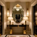
Gold: Accent, Light, and Geometry
Gold is not a color but a metallic accent. Art Deco uses brass, polished bronze, or satin gold (preferred to avoid excessive shine). Gold should be used sparingly, acting as a highlight or a thin line.
- Application: Thin profiles on furniture, mirror edging, hardware, chair legs, lighting fixtures. Critically important: the total area of gold elements should not exceed 5-7% of the visible surface.
- Combination: Gold pairs perfectly with black, creating a classic graphic duo. With emerald and burgundy, it enhances the depth and warmth of these shades.
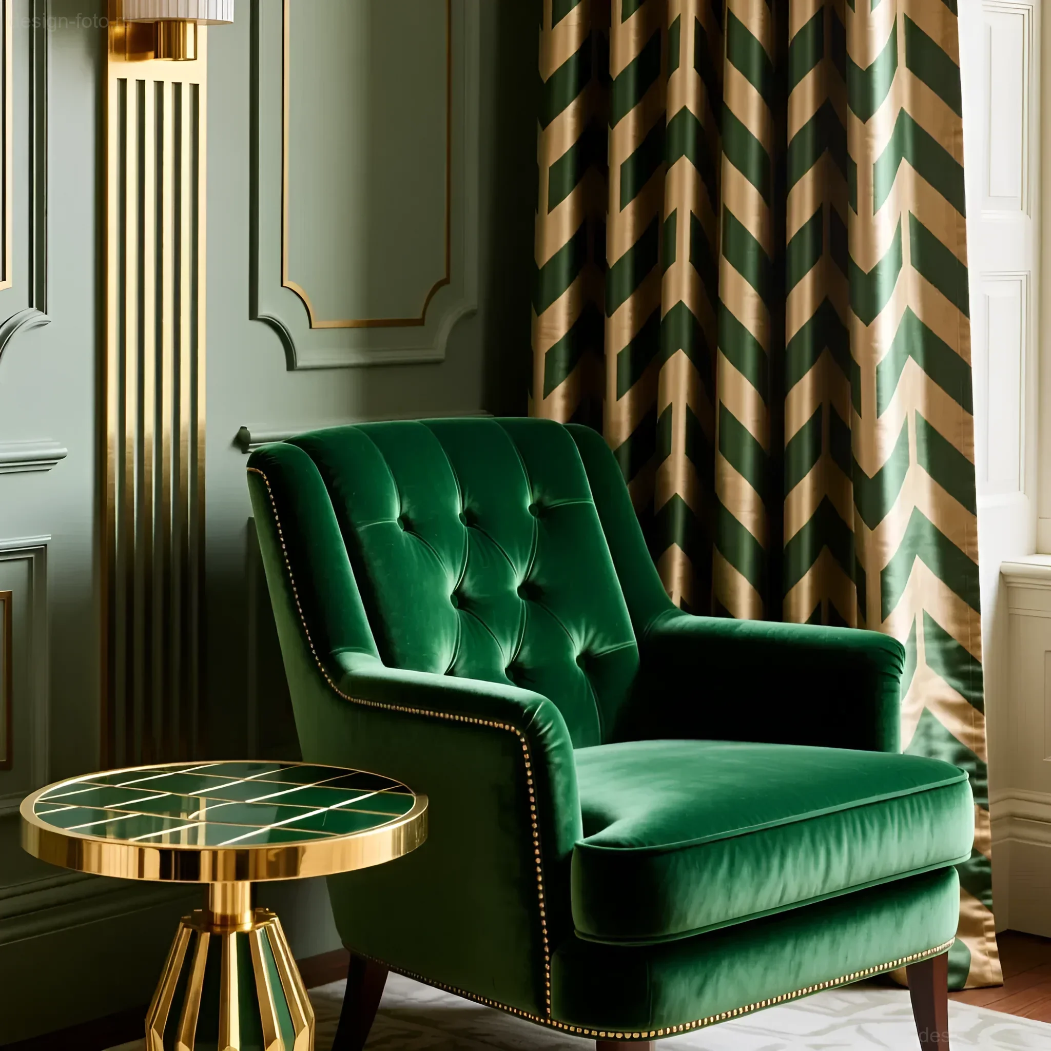
Emerald: Luxury, Nature, and Calm
Emerald (deep green, similar to NCS S 8010-G10Y) brings a sense of natural luxury to the interior. It is a color that, despite its richness, can be used in large volumes.
- Application: Upholstery for sofas and armchairs (preferably velour or velvet), accent walls in studies or bedrooms, large-format tiles or mosaics in bathrooms.
- Combination: Works beautifully with black (for contrast) and with gold (for shine). Emerald also harmonizes well with neutral shades – beige, cream, or light gray, which act as a background.
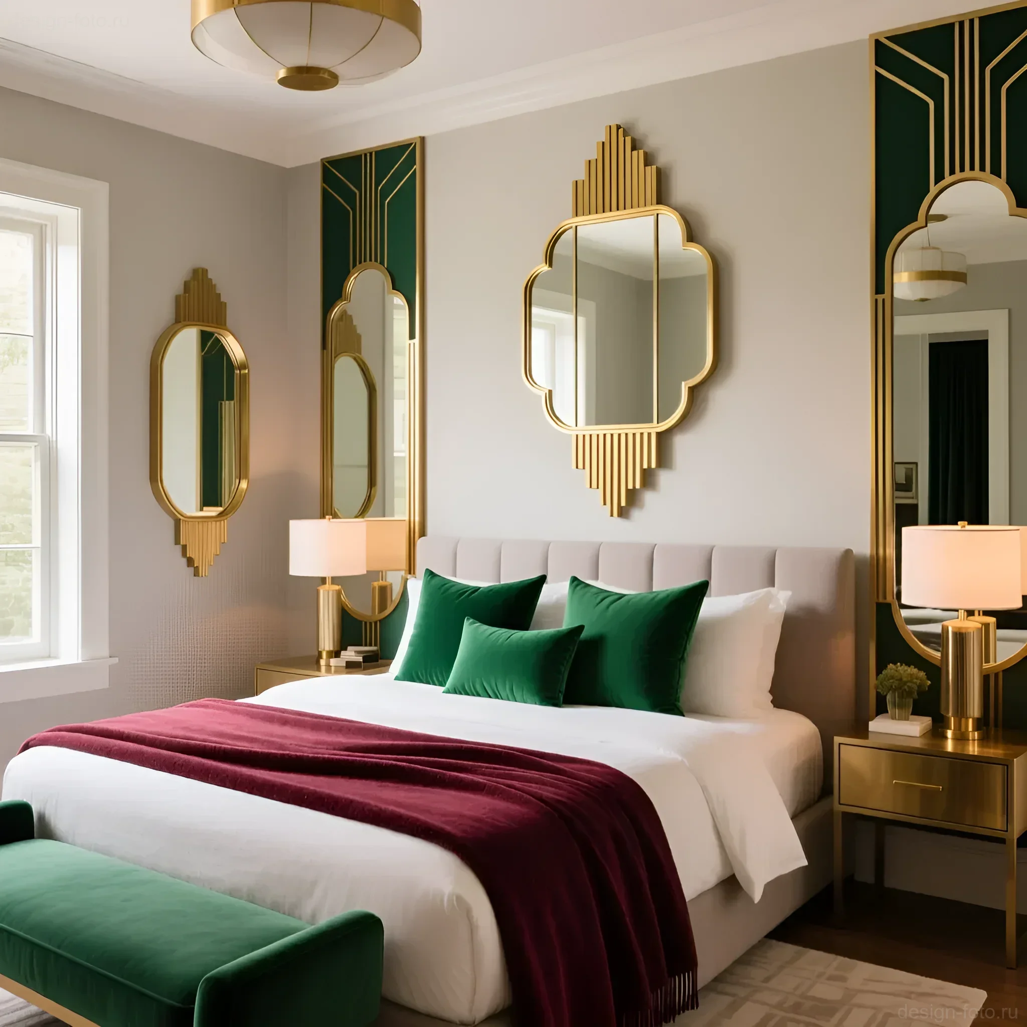
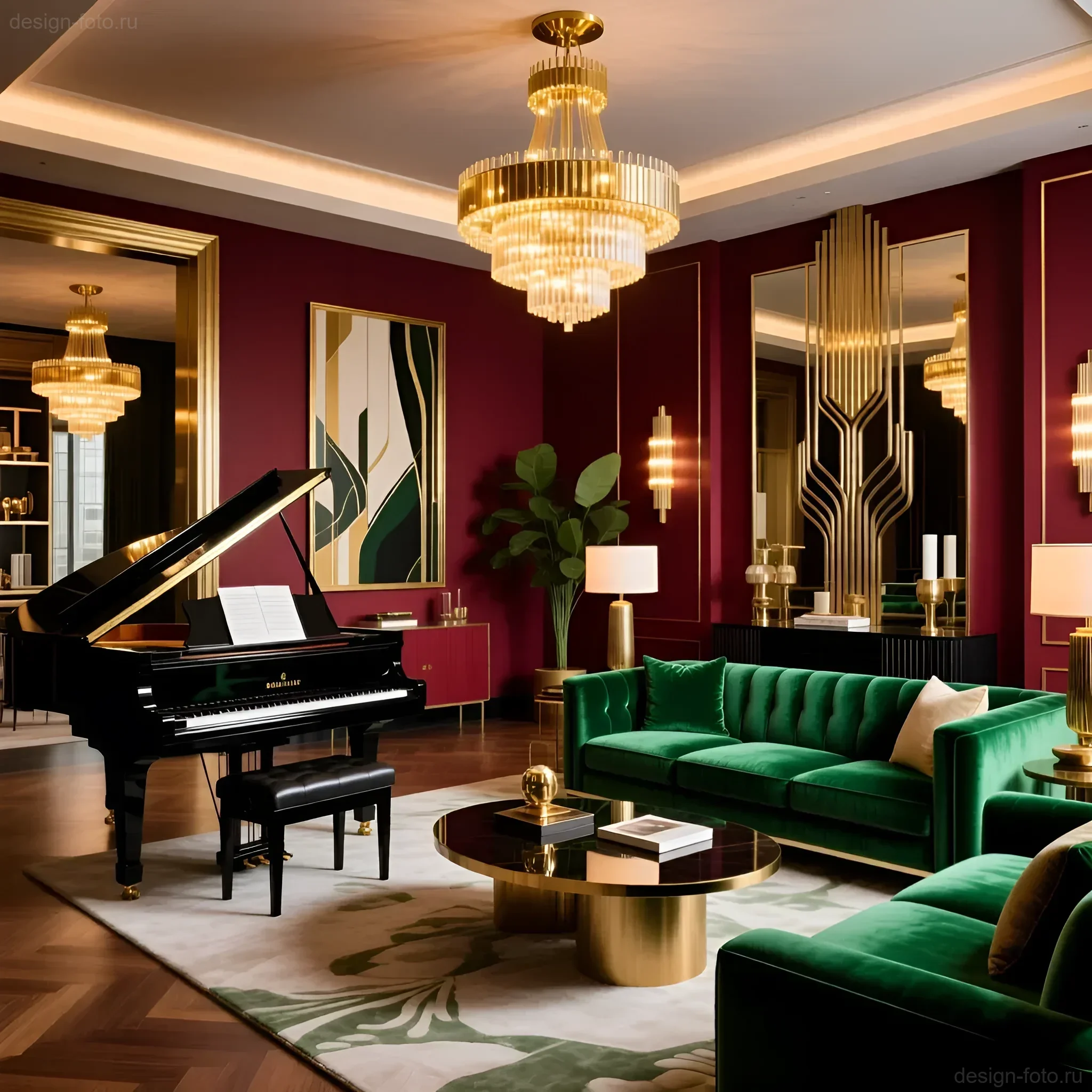
Burgundy: Drama, Warmth, and Depth
Burgundy (rich wine, marsala, or deep ruby) is the most dramatic color in this palette. It creates a sense of warmth and intimacy but requires careful dosing, especially in small rooms.
- Application: Heavy velvet curtains, rugs, decorative pillows, or upholstery for one large piece of furniture (e.g., a chaise lounge). In the kitchen or dining room, burgundy can be used for the interior of niches or buffets.
- Combination: Burgundy requires a light or neutral background so as not to “swallow” the space. Using it alongside gold accents enhances the feeling of richness.
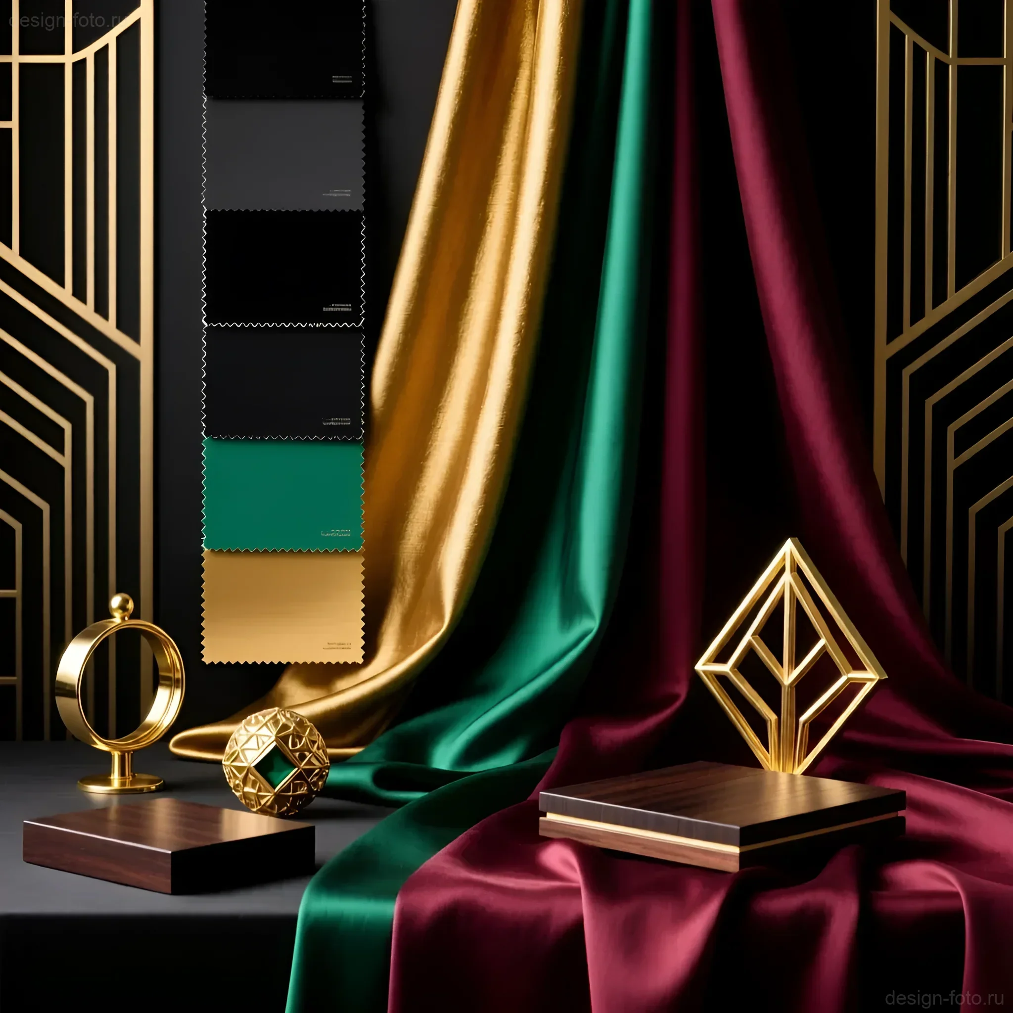
Materials and Textures that Emphasize Art Deco Colors: Velvet, Silk, Lacquer, and Metal
In Art Deco, color is inseparable from tactile sensations. The deep colors of this palette are most striking only on complex, expensive textures. The choice of material directly affects how light interacts with color.
Textures for Black and Gold
- Black Lacquer and Gloss: Use lacquered wood or enamel on cabinet fronts and dressers. A glossy black surface reflects light, adding dynamism and visually lightening bulky items.
- Marble: Black marble (Nero Marquina, Portoro) with white or gold veins is an ideal base for countertops and floors. The combination of cool stone and warm gold creates a perfect balance.
- Brass (Gold): Instead of painted “gold-look” plastic, always choose real brass or polished bronze for hardware, profiles, and lighting. This ensures durability and a noble satin sheen.
Textures for Emerald and Burgundy
These deep, rich colors require materials that can absorb and refract light, creating an effect of depth.
Emerald:
- Velvet (Velour): The ideal material. Velvet changes the shade of emerald depending on the direction of the pile and lighting, which gives the interior “life.” Recommended fabric density for upholstery is at least 500 g/m².
- Silk or Satin: Used for curtains or decorative pillows. Emerald on silk acquires a cooler and more aristocratic sheen.
Burgundy:
- Leather and Suede: Burgundy leather upholstery (e.g., on dining chairs or in a home office) gives the interior substance and vintage chic.
- Wood: Combine burgundy with dark wood species like wenge or walnut. This enhances the warmth and drama of the color.
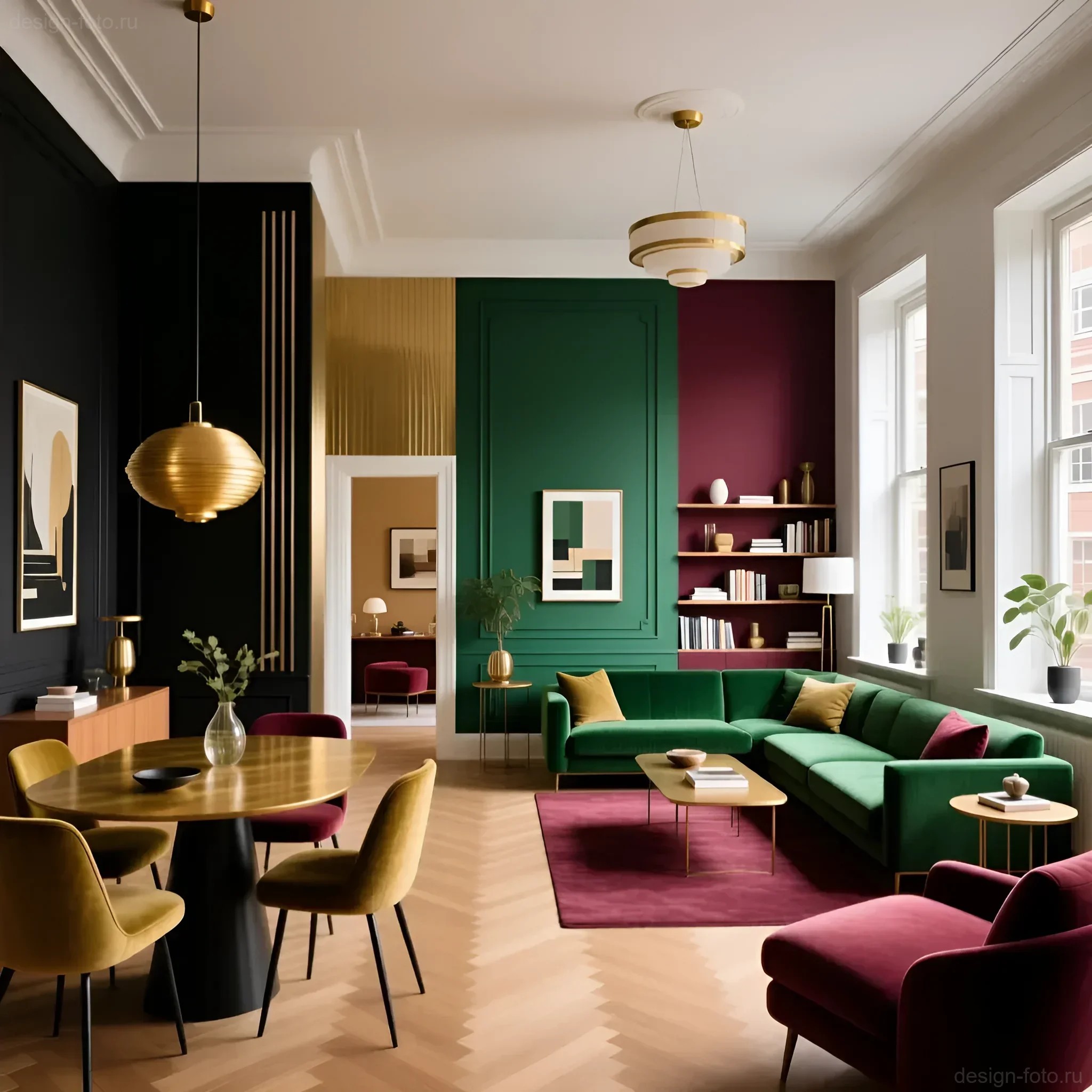
Art Deco Layout and Zoning: How to Use Colors for Visual Space Division
In open-plan layouts, characteristic of modern living, the Art Deco color palette is a powerful tool for zoning without building additional partitions.
Zoning with Black and Gold
Black is used to create an architectural frame that visually separates one functional zone from another.
- Kitchen-Living Room: Use black for the kitchen backsplash and island. Gold elements (faucet, handles) on a black background clearly define the work area. The transition to the living room is marked by black moldings on the walls or a black high baseboard that unifies the room’s perimeter.
- Library/Study: Black floor-to-ceiling shelving, framed by thin gold profiles, creates a clear vertical dominance, separating the work area from the relaxation zone.
Zoning with Emerald and Burgundy
These rich colors are used to highlight functional centers where emotional or visual focus is required.
- Dining Area: Highlight the wall behind the dining table with a deep burgundy color. If it’s textile wallpaper or a fresco, it will instantly create a dramatic backdrop. Above the table, be sure to place a large gold chandelier that will reflect off the burgundy surface, enhancing the effect.
- Relaxation Area (Living Room): Use an emerald velour sofa as an anchor for the space. Its rich color immediately attracts attention, defining the central axis of the relaxation zone. Add burgundy accent pillows for a warm contrast.
Important Technical Note: When zoning with color, ensure that the lighting in each zone matches its function. For example, an area with a burgundy accent requires warm light (2700K–3000K) to reveal the depth of the shade, while a workspace with black elements can use more neutral light (3500K).
Practical Tips for Using the Art Deco Color Palette in Interiors: From Accents to Total Style
To avoid a cluttered feel and maintain functionality, it’s essential to follow the rule of color balance and precise dosing.
The 60/30/10 Rule for Art Deco
The classic rule is adapted as follows:
- 60% – Base (Neutral Tones): Light gray, beige, ivory. This base provides light and air, preventing the rich colors from “crushing” the space.
- 30% – Main Accent Color: Emerald or Burgundy. Used for large furniture pieces or one accent wall.
- 10% – Contrast and Graphics: Black and Gold. Black is used for graphics (frames, legs, baseboards), and gold for highlights (hardware, decor).
Using Black and Gold in Details
Even in a minimalist interior, you can apply the Art Deco palette using only these two colors as a graphic accent:
In the Bathroom:
- Matte black tiles on the floor, imitating a geometric pattern.
- Plumbing and faucets made of polished brass (gold).
- Black shower screen in a thin gold profile.
In the Bedroom:
- A bed with a high headboard upholstered in neutral fabric, framed by a thin black wooden or metal trim.
- Bedside lamps with gold bases and black shades.
Introducing Burgundy and Emerald in Small Doses
If you’re not ready for a full color immersion, use these shades to create “islands” of luxury:
- Emerald: Use two or three accent pieces – a pouf, an armchair, and a vase. This is enough to declare the style.
- Burgundy: A burgundy rug with a geometric pattern that draws the eye, or a set of dining textiles.
Common Mistakes When Working with Art Deco Colors and How to Avoid Them
Working with such a rich and contrasting palette requires precision. Incorrect use can lead to the interior looking cheap, cluttered, or, worse, dysfunctional.
1. Gold Overload (The “Golden Palace” Syndrome)
Mistake: Using glossy, bright gold in large areas (e.g., gold wallpaper, gold ceilings, excessively massive gold furniture).
Solution: Gold is an accent, not a background. Choose satin brass, matte bronze, or antique gold. It should function as a highlight. If you use a large gold element (e.g., a mirror frame), remove other gold accents from that area.
2. Poor Lighting for Deep Colors
Mistake: Using cold or too dim light sources in rooms with burgundy or emerald walls.
Solution: Deep colors require warm and directed light (2700K) to reveal their texture. Use spotlights or wall sconces directed at textured surfaces (velvet, leather) to emphasize the depth and richness of the color. Without proper lighting, emerald can look muddy green, and burgundy can appear simply brown.
3. Ignoring the Neutral Background
Mistake: Trying to combine all four colors (black, gold, emerald, burgundy) across 100% of the area.
Solution: Always use 60% of a neutral, light background (cream, light gray). This gives the eye a place to rest and allows the rich colors to “play.” The background makes the interior modern and airy, not heavy.
4. Incorrect Texture Choice
Mistake: Using emerald or burgundy on smooth, cheap fabrics (e.g., synthetic cotton).
Solution: Rich Art Deco colors require complex, luxurious textures: velvet, velour, lacquer, natural leather. Texture is half the success in Art Deco.
Examples of Successful Art Deco Interiors Using Key Colors: Photos and Analysis
Let’s look at how this palette works in specific functional areas.
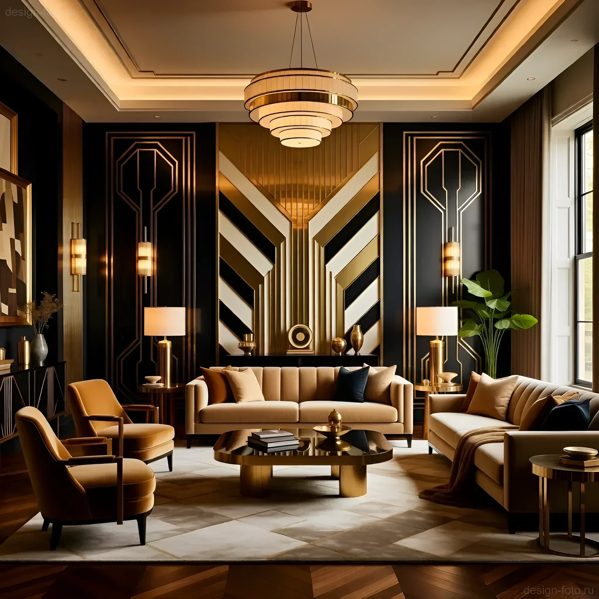
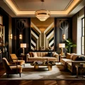
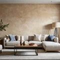
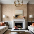
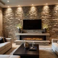
Living Room: Balance of Drama and Light
- Color Scheme: 60% light beige (walls, floor), 30% Emerald (sofa, armchairs), 10% Black and Gold (decor, graphics).
- Solution: Walls are painted in ivory. The accent wall behind the TV features black glossy panels with thin vertical gold inserts (1 cm wide brass profile). The sofa is emerald velvet. The coffee table has a black marble top on a gold geometric base.
- Functionality: Black and gold verticals visually increase the ceiling height. The light base ensures sufficient illumination during the day.
Study: Intimacy and Concentration
- Color Scheme: Dominance of deep tones. 40% Black (furniture, floor), 30% Burgundy (wall, upholstery), 20% Neutral (ceiling), 10% Gold (accents).
- Solution: One wall is paneled with burgundy velour. The desk is black lacquered with gold hardware. The armchair is upholstered in dark burgundy leather. The desk lamp is gold with directed light.
- Functionality: Deep, rich colors promote concentration and create the sense of intimacy necessary for work. Gold accents prevent a feeling of confinement.
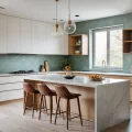
Kitchen: Geometry and Ergonomics
- Color Scheme: 50% Black (lower cabinets, backsplash), 40% Light Gray (upper cabinets, walls), 10% Gold.
- Solution: Lower kitchen cabinets are matte black MDF. Upper cabinets are light gray gloss. The backsplash is black subway tile with gold grout (or a thin gold profile). All hardware (handles, faucet) is brass.
- Functionality: The black lower cabinets are practical and visually “anchor” the kitchen mass. Gold hardware adds the necessary stylistic reference without cluttering the workspace.
Art Deco Colors: Questions and Answers (FAQ)
Can Art Deco Be Functional?
Answer: Absolutely. Modern Art Deco is not a museum piece. Functionality is achieved through the use of color for clear zoning and the selection of easy-to-clean materials (lacquered surfaces, durable velour, marble). Black, for example, is extremely practical in high-traffic areas.
Can Matte Gold Be Used Instead of Glossy?
Answer: Not only can it be used, but it should be, if you are aiming for a modern and expensive look. Matte or satin gold (brushed brass) looks more noble, does not create excessive shine, and pairs better with matte deep colors like emerald velvet.
How to Introduce Burgundy into a Small Apartment?
Answer: Do not use burgundy on walls. Introduce it in the form of vertical accents: tall burgundy curtains from ceiling to floor, or a narrow burgundy console. The key is to use this color on textured elements (velvet, silk) and ensure it has strong lighting.
What Neutral Colors Best Complement This Palette?
Answer: The best background is warm neutral shades: cream, ivory, warm light gray (greige). They support the warmth of gold and burgundy while providing the necessary contrast with black and emerald.
Interesting Facts About Color Usage in the Art Deco Era
Understanding the historical context helps us apply this palette more thoughtfully in modern projects.
- Egyptian Influence: The surge in interest in gold, black, and deep blue (often replacing emerald in early examples) was directly linked to the discovery of Tutankhamun’s tomb in 1922. These colors were associated with ancient luxury and exoticism.
- “Wine” Burgundy: Burgundy in Art Deco was often called “wine” or “ruby.” It symbolized the hedonism and celebration of life characteristic of the “Roaring Twenties.” This color was mainly used to create the atmosphere of boudoirs and private lounges.
- Black’s Graphic Quality: The use of black for framing and creating geometric patterns (e.g., black and white checkerboard tiles) was borrowed from Cubism and Futurism, emphasizing the connection of the Art Deco style with avant-garde art. Black in an Art Deco interior should always be sharp and graphic.
- The Role of Lacquer: The 1920s saw the flourishing use of lacquer finishes, especially black. This was due to the development of new technologies and the desire to give furniture and panels a mirror-like shine that enhanced the effect of luxury and reflected light in dark rooms.
By applying these four dominant colors – black, gold, emerald, and burgundy – with consideration for functionality and proper dosing, you will create an interior that is simultaneously luxurious, modern, and fully meets the high standards of ergonomics and aesthetics.
Рекомендуем:
 Art-Déco-Farben: Schwarz, Gold, Smaragd, Bordeaux – Luxus und praktische Tipps für Ihr Interieur
 Art Deco Mirrors: Geometry and Luxury That Transform Interiors
 How to Make a Brick Wall in an Interior (Imitation)
 Wall Cladding with Wood Paneling: A Step-by-Step Guide
 DIY Venetian Plaster: Is It Possible?
 Bark Beetle Decorative Plaster: Application Technology
Couleurs de l’Art Déco : noir, or, émeraude, bordeaux – luxe et conseils pratiques pour l’intérieur
Bark Beetle Decorative Plaster: Application Technology
Couleurs de l’Art Déco : noir, or, émeraude, bordeaux – luxe et conseils pratiques pour l’intérieur
 Grout for tiles: how to choose the color and apply it correctly
Joint filler for tiles: how to choose the color and apply it correctly
Art-Déco-Spiegel: Geometrie und Luxus, die das Interieur verwandeln
Grout for tiles: how to choose the color and apply it correctly
Joint filler for tiles: how to choose the color and apply it correctly
Art-Déco-Spiegel: Geometrie und Luxus, die das Interieur verwandeln
 Washable wallpaper for the kitchen: why it’s the best idea for your renovation?
 Priming Walls Before Wallpapering and Painting: The Ideal Foundation for Renovation
Colores del Art Déco: negro, dorado, esmeralda, burdeos – lujo y consejos prácticos para interiores
Espejos Art Déco: geometría y lujo que transforman el interior
Miroirs Art Déco : géométrie et luxe qui transforment l’intérieur
Priming Walls Before Wallpapering and Painting: The Ideal Foundation for Renovation
Colores del Art Déco: negro, dorado, esmeralda, burdeos – lujo y consejos prácticos para interiores
Espejos Art Déco: geometría y lujo que transforman el interior
Miroirs Art Déco : géométrie et luxe qui transforment l’intérieur
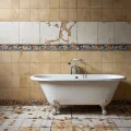 How to Update Old Tiles Without Removing Them: 99 Ways to Transform Your Bathroom and Kitchen
 Liquid Wallpaper: Pros, Cons, and Application Technology
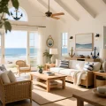 Nautical Style in Interior Design: How to Create a Coastal Atmosphere in a City Apartment
 How to Hang Vinyl Wallpaper on a Paper Backing?
 DIY Decorative Stone Wall Installation: Your Guide to Home Transformation