Working with studio space is always a challenge, requiring meticulous precision and a deep understanding of ergonomics. In limited square footage, where each functional zone must be clearly defined while maintaining a sense of a unified, bright volume, traditional wall construction becomes not only impractical but also detrimental. Our task as designers is to create “soft” zoning using exclusively visual and functional tools.
Ideal Studio Layout: What is Zoning Without Walls and Why It’s Important
The concept of studio living implies an open layout where the kitchen, living room, and bedroom are combined. Zoning without walls (or “visual zoning”) is a set of techniques aimed at structuring this open space. We don’t build capital partitions that block natural light (insolation) and eat up valuable centimeters; instead, we use furniture, light, color, texture, and architectural elements of the floor and ceiling.
Why This Is Critically Important for a Studio:
- Preservation of Natural Light: Light is the main resource of a small living space. The absence of walls allows it to penetrate freely into every corner.
- Sense of Space: In a studio of 25–35 m², even a thin drywall partition will make the space feel cramped. Zoning without walls preserves airiness and depth of perspective.
- Functional Flexibility: Non-permanent dividers (e.g., shelving units or screens) allow for quick adaptation of the space to current needs – from hosting guests to remote work.
- Budget Savings: We eliminate the costs associated with expensive construction and approval of partitions.
Styles and Concepts: Best Studio Zoning Techniques for Different Interiors
The choice of interior style directly influences which zoning tools will be most effective and appropriate.
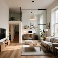
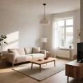
Scandinavian Minimalism: Light and Texture
The Scandi style is ideal for studios due to its emphasis on light colors and functionality. Zoning here is maximally delicate:
- Textiles: Using light, semi-transparent linen or cotton curtains as dividers to separate the sleeping area. They let light through but provide privacy.
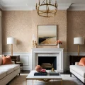
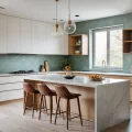
- Rugs: Clearly defining the living room area with a large, light-colored rug that contrasts with the main flooring (e.g., light oak floor and a gray wool rug).
- Color: The kitchen can be in pure white, while the relaxation area can feature warm gray or pastel shades.
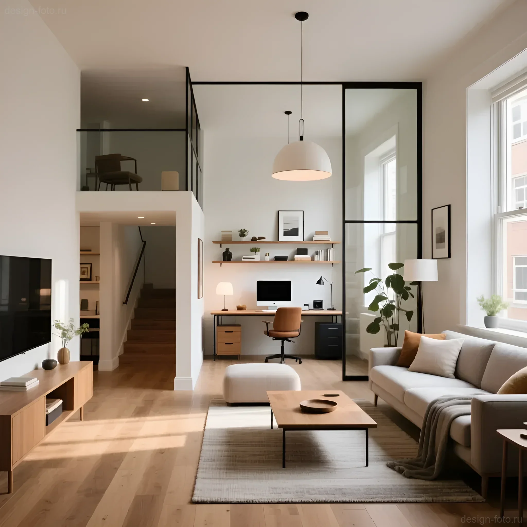
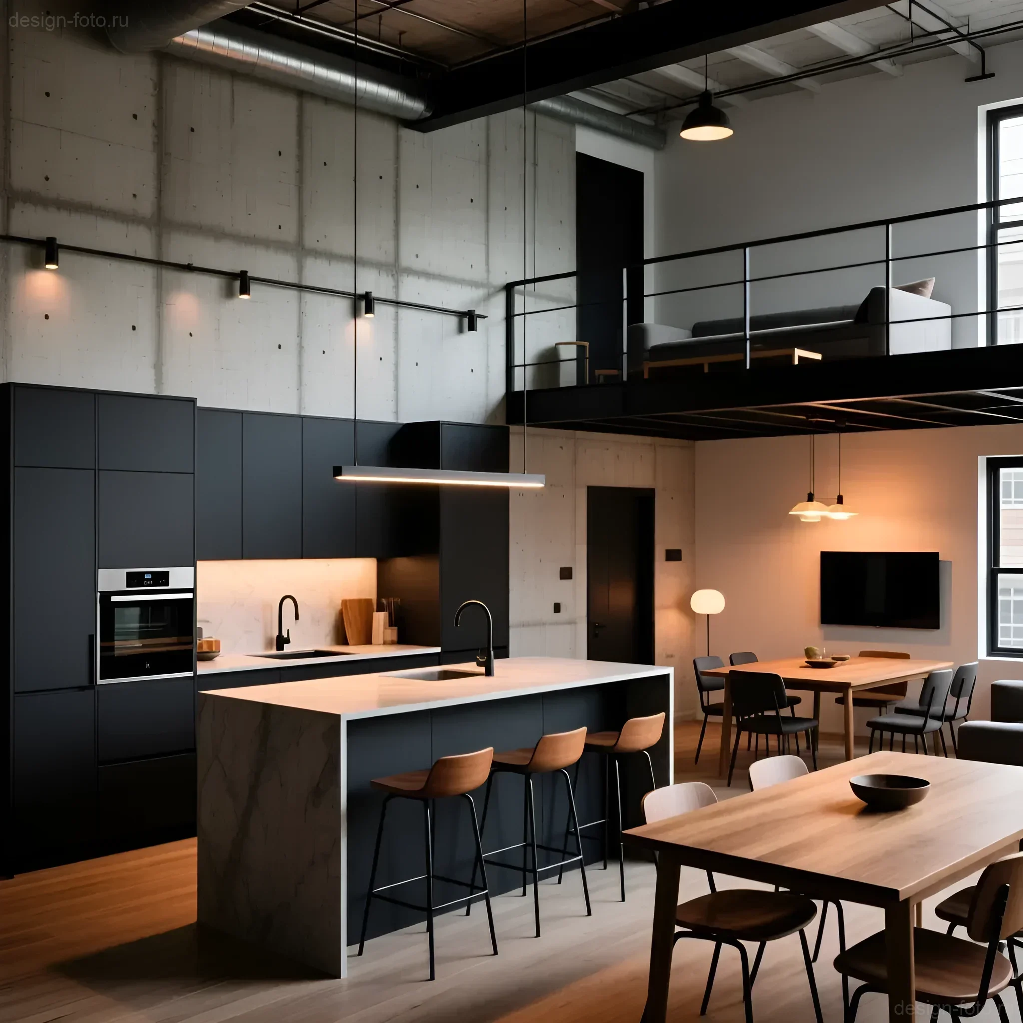
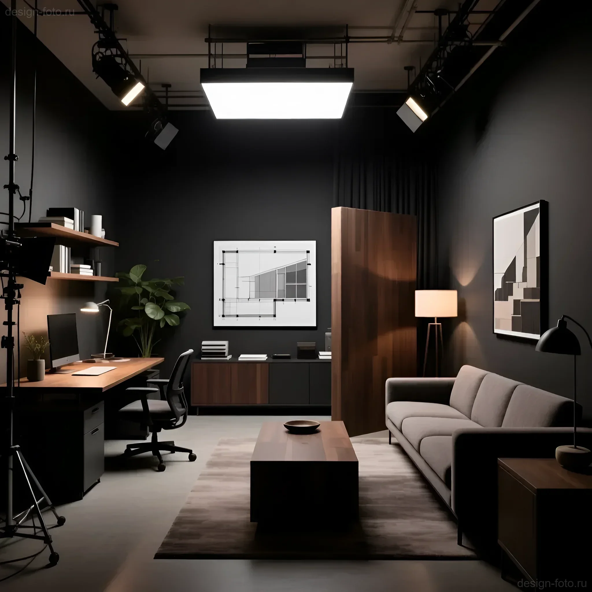
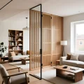
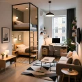
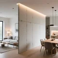
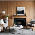
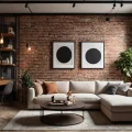
Loft and Industrial Style: Metal and Glass
Loft allows for the use of more robust and distinct dividers that remain transparent:
- Glass partitions in metal frames: This is the most popular technique in loft style. They are not walls but serve the function of sound insulation (partially) and clear visual separation.
- Open shelving units made of black metal: Ideal for separating a home office or library while maintaining an open view.
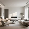
Modern Minimalism: Podiums and Transformer Furniture
Here, the emphasis is on clean lines and the absence of visual clutter. Zoning is achieved through geometry and multifunctionality:
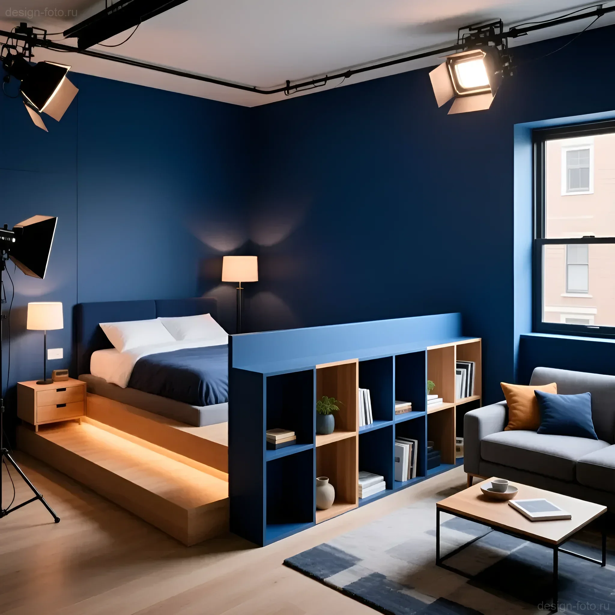
- Podiums: Raising the sleeping area by 30–50 cm, which not only visually separates it but also creates additional storage space (drawers).
- Built-in furniture: Using a single long furniture unit that serves as a kitchen set, bar counter, and workspace.
Materials and Color Solutions: How to Visually Divide Studio Space
The right choice of finishing materials and color palette is the foundation of zoning. We use differences in texture and color to create “invisible boundaries.”
Flooring: Functional Contrast
This is the most effective zoning method. Different floorings clearly delineate transit and functional zones:
- Wet areas (kitchen/hallway): Use porcelain stoneware or tiles. They are practical, easy to clean, and immediately signal a change in function. Recommended transition: from 60×60 cm tiles to the main flooring.
- Living areas (living room/bedroom): Prefer laminate, engineered wood, or vinyl. It’s important that the color and tone are close, but the texture differs.
- Important nuance: Try to avoid complex curved joints. A straight joint, running strictly under the bar counter or along the kitchen island line, looks professional and neat.
Color Accents and Vertical Zoning
Walls and ceilings can act as dividers without requiring physical structures:
- Accent Wall: The wall behind the headboard or sofa can be painted in a deeper or richer color, or covered with wallpaper with a pronounced texture. This instantly highlights the center of the zone.
- Ceiling: In the kitchen area, a matte stretch ceiling can be used, and in the living area, a plastered ceiling painted in warm white. Wooden slats or panels above the relaxation area are also effective.
- Gradient: Using gradient painting, where the color smoothly transitions from saturated (in the kitchen area) to light (in the bedroom area), creates a sense of movement and depth.
Layout and Ergonomics: Optimal Placement of Functional Zones in a Studio
Before choosing dividers, it’s essential to develop an ideal ergonomic plan. In a studio, the placement of zones is determined by strict building codes (wet areas) and principles of convenience (transit paths).
The Working Triangle Rule in a Studio
Even in the smallest studio kitchen, the “working triangle” rule (storage – sink – cooking) must be observed. The optimal distance between the vertices of the triangle should be at least 120 cm and no more than 270 cm. Linear or corner layouts are most common in studios.
Ergonomic Standards for Living Areas
- Transit Passages: The minimum width of a passage between furniture (e.g., a sofa and a bar counter) should be 60–70 cm. The ideal figure is 90 cm.
- Distance to TV: For comfortable viewing, the distance from the sofa to the screen should be approximately 1.5–2 times the screen diagonal. For example, for a 55-inch TV (140 cm), this is 210–280 cm.
- Sleeping Area: If the bed is separated by a shelving unit, at least 50 cm should be left for access to the bed on one side if it’s against a wall, or 70 cm on both sides for a double bed.
Table: Optimal Dimensions of Dividing Elements
| Element | Zoning Function | Recommended Dimensions (Height/Depth) |
|---|---|---|
| Bar Counter/Island | Separating Kitchen and Living Room | Height 90–110 cm; Countertop Depth 60 cm |
| Open Shelving Unit | Separating Bedroom/Workspace | Height 180–220 cm; Depth 30–40 cm |
| Podium | Visual and Functional Separation of Bedroom | Height 30–50 cm |
| Sofa with Console | Defining Living Room Area | Console/Backrest Height 70–80 cm |
Practical Designer Tips: 10 Effective Ways to Zone a Studio Without Building Partitions
These methods have been tested in practice in dozens of studio projects ranging from 20 to 40 m² and have proven effective in creating clear, but not enclosed, zones.
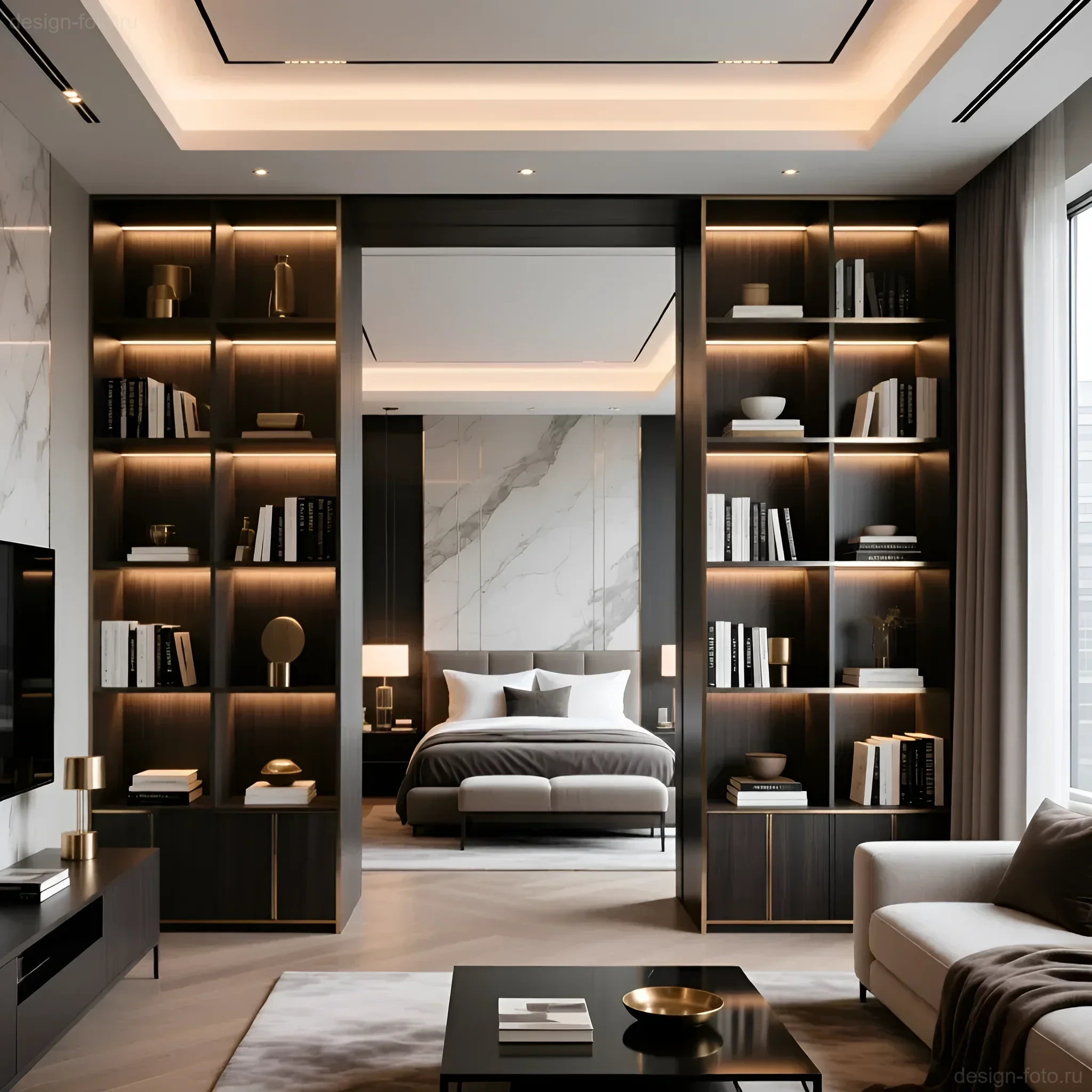
- Using Open Shelving Units (Kallax-type): A shelving unit with open sections, filled only halfway, allows light and air to pass through but clearly divides the space. It’s an ideal divider between the living room and bedroom. Tip: Use shelving units with a depth of no more than 35 cm to avoid cluttering the space.
- Bar Counter or Kitchen Island: The most functional divider. A counter (height 105–110 cm) not only separates the kitchen but also serves as a dining area and additional workspace.
- Furniture Oriented by Backrest: A sofa placed with its back to the kitchen or hallway instantly creates a “wall” for the living room. To enhance the effect, a narrow console with decor or table lamps can be placed behind the backrest.
- Lighting Scenarios and Accent Lighting: The “softest” method. Each zone should have its own lighting. For example, pendant lights over the bar counter, track lighting in the kitchen, and a floor lamp next to the sofa. Turning off the light in one zone and turning it on in another instantly shifts the focus.
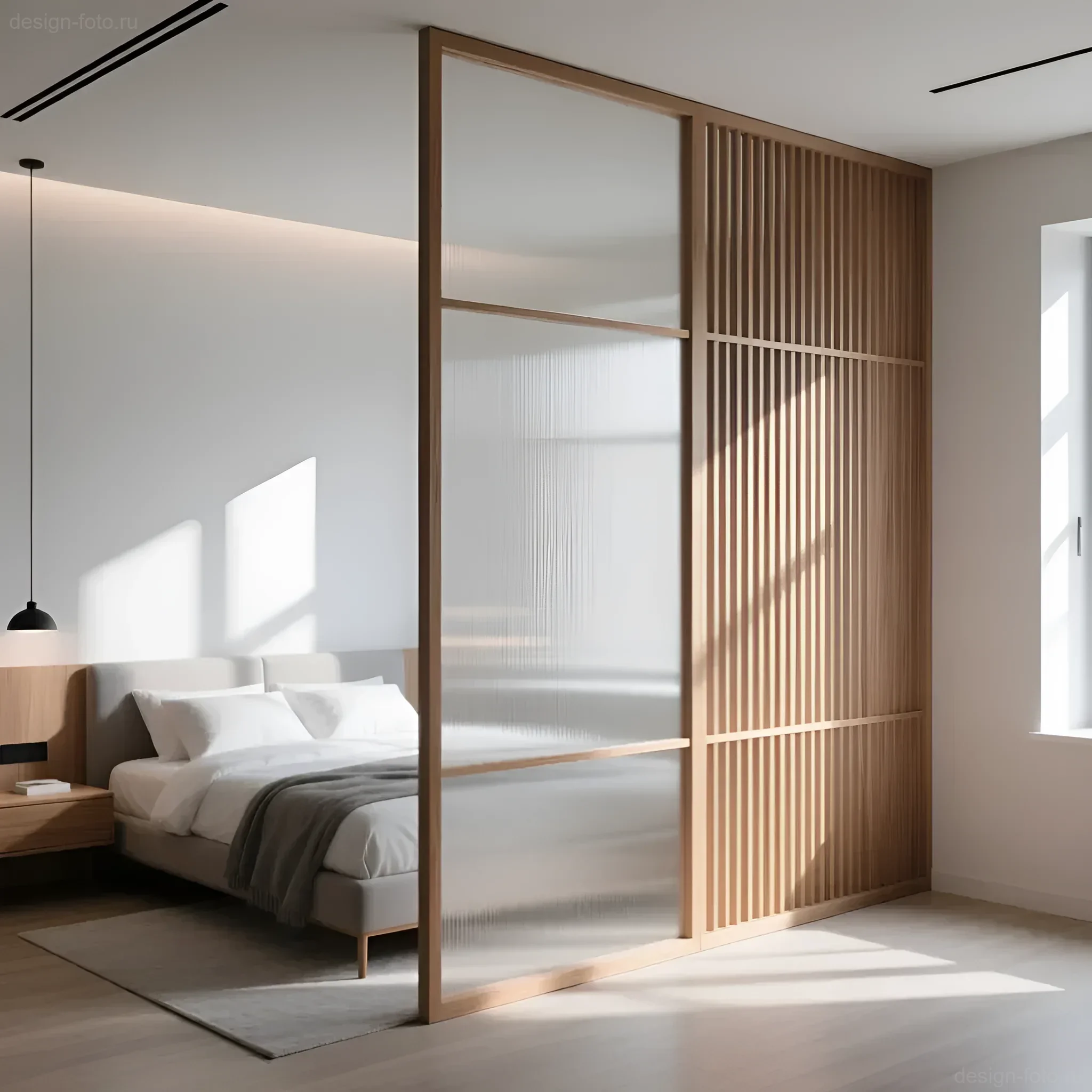
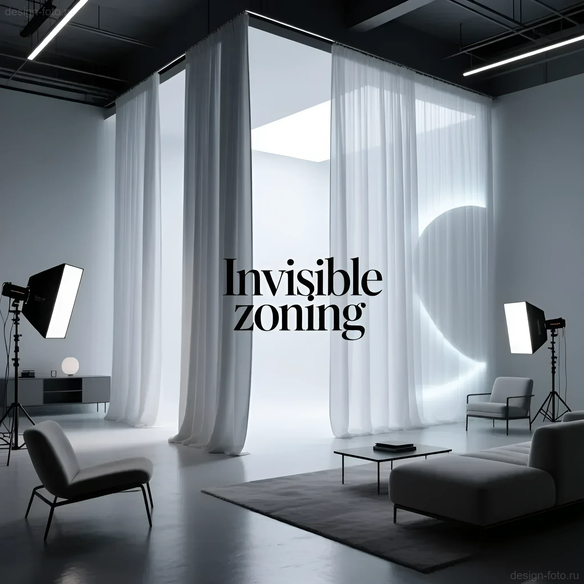
- Textile Dividers (Curtains): Using dense curtains or Japanese panels hung from a ceiling track. Unlike permanent walls, they can be fully retracted. Choose fabrics that match the walls to avoid visual overload.
- Sliding Slatted Partitions (Lamellas): Wooden or MDF slats attached to the ceiling and floor. They create a semi-transparent boundary without obstructing air circulation. Recommended spacing between slats is 5–10 cm.
- Color Block on the Wall: Using painter’s tape to create a geometric color block that visually frames a zone (e.g., a workspace).
- Podium with Storage: A raised floor (from 30 cm) that creates a clear boundary for the sleeping area. Inside the podium, a spacious storage system can be organized, compensating for the lack of a walk-in closet.
- Mirrored Surfaces: A large mirror placed in the hallway or at the boundary of zones not only visually enlarges the area but also reflects light, making the space brighter and deeper.
- Green Walls or Vertical Gardening: Using tall floor plants (e.g., ficus or palms) or vertical green walls as a living, eco-friendly divider.
Common Mistakes in Zoning Small Studios and How to Avoid Them
Incorrect zoning can completely negate the advantages of an open layout. As professionals, we must warn clients about the pitfalls.
Mistake 1: Excessive Dividers
Problem: Trying to use multiple zoning methods at once (e.g., a podium, a shelving unit, and contrasting floor colors) in one small space. This creates a sense of chaos and a “patchwork quilt.”
Solution: In a studio up to 30 m², it’s enough to use 2–3 key techniques: Floor + Light + Functional Furniture. Choose one dominant divider.
Mistake 2: Incorrect Furniture Scale
Problem: Using bulky, oversized furniture (e.g., a deep modular sofa or a full-wall wardrobe) as a divider. Such furniture visually “presses down” and steals air.
Solution: Choose light, easily movable furniture. Shelving units should be open, sofas should be on thin legs. The depth of wardrobes should not exceed 60 cm, and it’s better to use built-in niches.
Mistake 3: Blocking Transit Zones
Problem: Placing dividers (e.g., a bar counter) in a way that obstructs free passage between zones, leading to constant discomfort and “detours.”
Solution: Always leave a minimum passage of 70 cm. If using an island, ensure there is at least 100–120 cm between it and the kitchen front for comfortable cabinet opening and movement.
Mistake 4: Ignoring a Unified Style
Problem: Each zone is designed in its own style and color. For example, the kitchen is loft, and the bedroom is Provence. This destroys the idea of a studio as a single space.
Solution: Maintain a unified base (walls, ceiling, main furniture color). Introduce differences only through accents, decor, and textiles that are easy to replace.
Examples of Successful Solutions: A Photo Gallery of Studio Zoning from Floor to Ceiling
Let’s consider several typical situations we encounter when working with studios and how they were resolved using non-structural zoning methods.
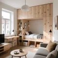
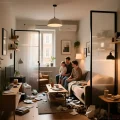
Case 1: 28 m² Studio with One Window
Task: To maximally separate the bedroom without blocking light.
Solution: An L-shaped open shelving unit, 200 cm high, was used. One side is adjacent to the wall, and the other to the sofa. The shelving unit allows 60% of light to pass through. Additionally, the sleeping area is raised on a 35 cm podium, which houses seasonal items. All other furniture is white and suspended to keep the floor as open as possible.
Case 2: Narrow 32 m² Studio (“Penal”)
Task: To divide a long, narrow space into three functional zones (kitchen, living room, workspace).
Solution: Zoning was achieved using two key elements. The kitchen is separated by a long bar counter-console. The workspace (by the window) is separated from the living room by a tall floor plant and a color block on the wall (deep blue against a light gray background). The flooring in the kitchen is tile, and in the rest of the area, it’s engineered wood laid diagonally to visually widen the space.
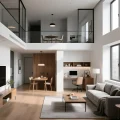
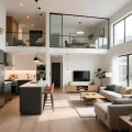
Case 3: Studio with High Ceilings (3.2 m)
Task: To utilize the height for zoning and storage.
Solution: A second level (mezzanine) was implemented in the sleeping area. This is a radical but highly effective zoning method that completely isolates the bedroom and frees up the area underneath (e.g., for a walk-in closet or office). In the living room area, the ceiling was lowered using drywall, allowing for built-in accent lighting and visually “grounding” this part.
Frequently Asked Questions About Studio Zoning: Expert Answers for design-foto.ru
1. Can screens be used if a family with a child lives in the studio?
Yes, but with caveats. A stationary screen (e.g., made of rattan or wood) creates coziness but does not provide sound insulation and is not safe for young children (risk of tipping). It’s better to use Japanese panel curtains, which attach to the ceiling and are easily retracted, or shelving units securely attached to the wall and floor.
2. How to zone space if a podium cannot be used (low ceilings)?
If the ceiling height is less than 260 cm, a podium (even 15 cm) is not recommended as it will visually reduce the volume. In this case, use lighting zoning (a separate chandelier over the bed and perimeter lighting), as well as different wall textures (wooden panels behind the headboard). The main thing is to create a contrast between the floor and the wall specifically in the sleeping area.
3. What type of lighting is best suited for studio zoning?
We recommend track lighting systems. They are versatile, easily adjustable, and allow for directing light precisely to the desired zone. For the kitchen – bright, functional light (4000K). For the living room – warm, relaxing (3000K). A clear boundary created by different color temperatures is a professional and subtle zoning technique.
4. What role does transformer furniture play in zoning without walls?
Transformer furniture (e.g., a fold-down bed built into a wardrobe, or a table that slides out from a bar counter) is not only a space-saving solution but also a tool for temporal zoning. When the bed is hidden, the area functions as a living room or office. When it’s folded down, it’s a clearly defined bedroom. This is dynamic zoning, allowing the studio to change its function throughout the day.
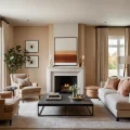
5. How effective are rugs for dividing zones in a studio?
Rugs are an excellent, but not the only, tool. They perfectly outline the boundaries of the living room. It’s important for the rug to be large enough: the front legs of the sofa and armchairs should be on it. A small rug “floating” in the middle of the floor will only emphasize the small size of the room. Use a rug in conjunction with accent lighting (a floor lamp or sconce) located in the same zone for maximum effect.
Рекомендуем:
 Interior Layout and Zoning: An Expert Guide to Creating Functional Space
 Mobile Zoning: Screens, Shelving, and Curtains for a Flexible Living Room
 Zoning a Small Apartment: 50+ Expert Ideas for Studios and One-Bedroom Units
 Budget Zoning: How to Create Comfort in a Rented Apartment Without Renovation
 Zoning a One-Room Apartment for a Family: Practical Solutions and Ergonomics
 Functional Zoning of a Kitchen-Living Room: A Practical Guide from an Architect
 Which Tile to Choose for a Small Bathroom: Color, Size, Texture, and Space-Expanding Secrets
 Bedroom and Workspace Zoning: Comfort, Ergonomics, and Productivity
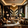 Art Deco Colors: Black, Gold, Emerald, Burgundy – Luxury and Practical Tips for Your Interior
 Drywall Partitions for Zoning: Functionality, Installation, and Ergonomics
 La planification idéale d’un studio : comment diviser les zones sans murs et préserver l’espace
 Internal Wall Insulation: Materials and Technology
 How to Hang Vinyl Wallpaper on a Paper Backing?
 Minimalism in Interior Design: The Secret to Style, Ergonomics, and the Line Between Emptiness
 Wall Cladding with Wood Paneling: A Step-by-Step Guide
 How to Maintain Perfect Order in a Minimalist Interior: A Practical Guide
 Interior Design and Pets: How to Combine Aesthetics and Pet Comfort
 Washable wallpaper for the kitchen: why it’s the best idea for your renovation?
 How to Make a Brick Wall in an Interior (Imitation)
Zonage d’un appartement d’une pièce pour une famille : solutions pratiques et ergonomie
How to Make a Brick Wall in an Interior (Imitation)
Zonage d’un appartement d’une pièce pour une famille : solutions pratiques et ergonomie